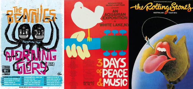
 Adam Collins This brilliant graphic design artist is responsible for some of the finest poster work circulating around Australia right now. Putting together intricate pieces of the likes of party boy punk reggae dudes The Bennies, Collins also creates stunning promotional pieces for venues around Melbourne.
 Sophie Miles Having cut her teeth as a radio announcer on the likes of 3CR and 3PBS to working as a freelance music journalist for years through The Age, Rhythms and Rolling Stone (to name a short few) Miles has worked solidly within the music industry. She is also the director and co-founder of Mistletone, an Australian touring agency that naturally works hand-in-hand with band promotion, overseeing poster art daily.
 Jack Stavrakis Meet Jack Stavrakis, a band booker at Melbourne live music venue, The Evelyn Hotel. A staple in the Victorian capital’s scene, The Evelyn hosts a range of live music from local to international names, who else better to speak to than a person who depends on attention-grabbing posters?
 Benny Montero This man exudes all forms of art and creativity. Having recently displayed his artworks in galleries as well as having written and performed music around Australia, Bjenny Montero is well versed in the world of music.
This year alone he has creations have been used by the likes of Kurt Vile as well as well as the album artwork for Perth psychrockers, Pond.
Understand The Function Of A Gig Poster
Adam: Firstly, and probably the most important factor of designing a poster is understanding the function of a gig poster. As with all forms of graphic design, first and foremost, we are trying to communicate visually with an audience. When you’re designing a gig poster (as opposed to general ‘advertising’), you’re lucky in that the ‘product’ – in this case, the entertainment – generally sells itself, so this affords you extra room to be creative.
That’s all well and good though, and you can engage your audience with great illustration and eye popping colours, but that’s pointless if it’s impossible for them to read and get information – because, at the end of the day, the simple function of a gig poster is to get an end result of punters in the door. Realise that you’re often going to have just a few seconds to communicate the information to the audience (if you’re lucky enough to grab their attention to begin with), so keep your details like gig date, venue, time, ticket information etc easy to read and relatively uncluttered.
Jack: “To me this is the most important thing to keep in mind when creating a poster. A poster is a way of branding yourself. Don’t think in terms of creating one great poster for each gig; think about creating a cohesive series of great posters that people will remember you by. An ongoing theme or style of poster is a great way to get this cohesion. Having a hand drawn image for one poster and a photo of yourselves for the next will do nothing to cement you in anyone’s mind. People should be able to look at a poster and know who you are and what you are about without seeing your name. ”
Know Your Audience And Client
Adam: “As with any kind of design, it’s important to understand both the target audience, as well as the client – in this case, it’s the artist / band and their music. When designing a poster, especially if I’ve been given free reign, if I’m not already familiar with the band / artist’s music and aesthetic then I’ll have a listen to their music (and often keep it running in the background while designing) and see what kind of images that conjures up. Sometimes I’ll take a look at previous tour posters / shirt designs / album covers… then try to make it fit within that kind of aesthetic, but a little bit left of centre. You want to connect with fans (and potential fans) of the band, but you don’t want to create something that fits the mould of their previous aesthetic to a tee, so keep it fresh to connect with your audience.”
Jack: “Before most people listen to your music they will see your posters. Once a poster is at a venue it will be seen by hundreds of people who pass through the place to eat, drink or watch bands. If your poster catches one of these punters eyes then they are more likely to look you up, listen to your songs or even come down to your show! A poster isn’t something to be neglected, think of it as your first impression. Try and think of something that people haven’t seen before – push some boundaries! Even if you don’t pull it off 100% people are likely to appreciate it more than the poster with the photo of a band with their back against the wall with white font on the top and bottom of the image.”
Have Your Own Style
Jack: “Every band/event has a certain vibe that they like to give off. Social media and interviews are used to show how off the much fun you will have at a show, how serious an event or band is or as a means to let others know of their beliefs. There is no reason why a poster shouldn’t be used in much the same way. A poster (along with your bands promo pic) is a great way to let people know what you are about. Know what sort of vibe you want to give off when people see you and think about incorporating this into your poster!”
Don’t Over Complicate It (conceptually!)
Adam: “Brainstorm your concepts – make a mind map if that helps you. You have to remember that you’re often dealing with just an A3 size poster at times (sometimes even much smaller if the poster is going to be used as A6 flyers too), so it’s not a great idea to try and fit lots of ideas within the one poster. Pick your strongest concept and roll with it, keep your others rather than trying to fit them into the design too – they may come in handy for future design projects. Concepts that haven’t been used for a design often make a reappearance later on (albeit in a more refined state) in quite a bit of my work, which has proved to me that they’re definitely worth hanging on to.”
Don’t Be Afraid To Be A Little Out There
Adam: “Seeing the same types of gig posters with the same styles and concepts is boring! Not to mention it’s just going to get lost in the pile of posters for other, competing gigs. Electronic music is notoriously bad for this.
Don’t be afraid to get a little crazy if the job calls for it, at the end of the day, the client is paying for your creativity, so if you want to put a taco using another taco shell as a skateboard half pipe (I already did that one though, sorry), or use a wild colour scheme, some quirky humour or an out there juxtaposition then go for it! You’re lucky to be afforded the creative breadth that the medium of a gig often gives you, so have fun and enjoy it. Maybe just run it by your client first before you do anything too out there…”
Or Really Out There (If Situation Permits)
Sophie: “Mistletone has always consciously worked with artists as artists (not as “designers” or heaven forbid, “creatives”), so when it comes to creating artwork for our tours, we like to give visual artists complete freedom to let their imaginations run wild.
Sometimes this means a poster does not comply with “the rules” for gig posters. Our first ever poster was by Nathan Gray for Ariel Pink’s Australian tour in 2006 and the words “Ariel Pink” were pretty much illegible but it was one of the most amazing tour posters I’ve ever seen. This has set the tone for all the posters we have commissioned since. The artwork is the product of the artist responding to the music and is an unpredictable and magical process.”
Benny: “Drugs help everything you do throughout the day and especially making posters. Make sure you have something that keeps you focused and in the zone plus endless stamina. Make the writing illegible and the design really busy then get someone with graphic design skills to clean up your mess.”
Pick An Effective Colour Palette
Adam: “Choosing a colour palette can be a bit of a process of trial and error at times, but it’s worthwhile when you get the perfect combination that really enhances your design. I try to keep to a fairly minimal colour palette with a lot of my designs as it suits my work and when you’re bombarded with full colour images everywhere, a nice 3 colour design can really stand out.
Not only does the less-is-more approach seem to work better for posters, it also means that your design will translate better to be screenprinted on shirts, if the band / artist decides they want to do that – especially since keeping colours to a minimum means keeping production prices down. It’s also worthwhile noting that there are some resources out there that can be helpful in consolidating a colour palette if you get stuck.”
Don’t Be Afraid To Ask For Help
Jack: “Can’t draw? Don’t know how to use Photoshop? Then you probably shouldn’t be making posters! I mean, your poster is never going to be any good if you don’t have any clue what you are doing. Know your limits; you don’t have to control every part of your band or event. Everyone knows at least one person who is a wiz with Photoshop or pencils. Just go and ask them for some help, the end result will always be better!”
Typography
Adam: “Any designer worth their salt will be constantly checking out new fonts and typographic techniques to add to the arsenal. There’s a few good websites out there for both free and paid fonts, and it’s pretty important to keep up with the pack or you’ll end up using the same couple of fonts for all your design projects. Font selection is pretty important and can make or break a design, be prepared for some trial and error in the process to get them just right, and know how to adjust things like kerning, leading and tracking.
Like my colour palettes, I like to keep my font choices to a minimum as well. Usually 2 fonts (a display font and an ‘information’ font), you may want to mix it up with serif and sans serif fonts. Occasionally I’ll add an extra font or two if the design is required to be very type heavy. Hand rendered type is an excellent option to stand out from the pack, and experimenting with different brushes within Illustrator can turn out some great results. I’ve only recently started using a Wacom tablet more within my work and it is so much easier to create things like natural hand rendered type, so I’d highly recommend looking into one if you’re wanting to do this type of work.”
Jack: “A simple rule, your band name is important. It is obviously vital that one can read it. You would be surprised by how many bands choose ‘cool’ or small fonts that means all the information they have included is unreadable.”
Always Evolve / Don’t Become Stagnant
Adam: “Approach each design project like one that can push you as a designer by trying new things – new techniques, styles, typography, colour palettes etc. You can have all the design inspiration resources in the world, but it’s no good if you can’t translate your concepts into your own original design effectively. Don’t be afraid to learn new techniques and styles by emulating things you like and taking bits and pieces to form your own style.
The internet is a wonderful resource for tutorials to learn new things (a lot of the time for free) and for other work to inspire your creative juices – use them. Be on the constant lookout for other designs and analyse what you do and don’t like about them to help you in your own design process. Look at what’s effective and what isn’t effective and take those ideas to incorporate into your own work in your own way.”


